White menu refers to drop down menu which adopts white as the main color to navigate website. As we known, white is the feasible color to match with all kinds of color, it can create wonderful visual matchable effect with other colors. Similarly, white menus are also wild navigation menu to decorate most websites of different colors. Besides color, white menus can be built in horizontal level, vertical level, tab menu, round-corner menu and multi-column menu. Next, let’s appreciate changeable menu styles:

White menu – horizontal menu

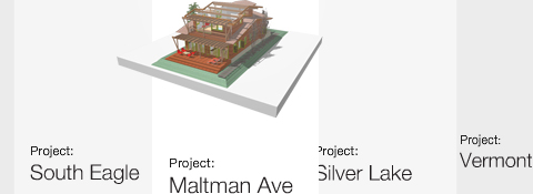
  • Special menu designed by Jason Reed Web

White Menu - Horizontal Menu

  • Gotmilk Flash menu

White Menu - Horizontal Menu

  • Web menu designed by Jeremy Levine

White Menu - Horizontal Menu

  • Maxandlous.com unusual menu

White Menu - Horizontal Menu

  • JavaScript menu with handwring style

White Menu - Horizontal Menu

  • Web menu with button style

    White Menu - Horizontal Menu

  • DHTML Menu for Jayme Blackmon

White Menu - Horizontal Menu

  • Alex Buga menu

White Menu - Horizontal Menu

  • Water’s Edge Media web menu

White Menu - Horizontal Menu

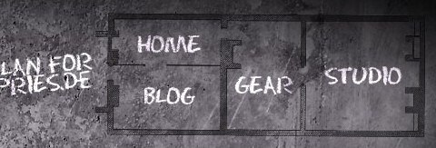
  • Ronnypries.de navigation menu

White Menu - Horizontal Menu

  • Pipe DHTML menu

White Menu - Horizontal Menu

White menu – round corner menu

  • Round style menu with mouse over

White Menu - Round Corner Menu

  • Silver round corner menu

White Menu - Round Corner Menu

White menu – tab menu

  • Silver tab menu

White Menu - Tab Menu

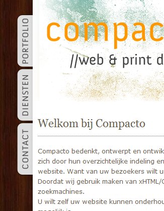
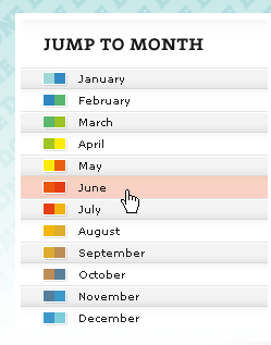
  • Vertical tab menu

White Menu - Tab Menu

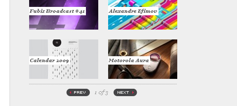
  • Fubiz slidebar

White Menu - Tab Menu

  • Great FreelanceSwitch menu

White Menu - Tab Menu

White menu – multi-column menu

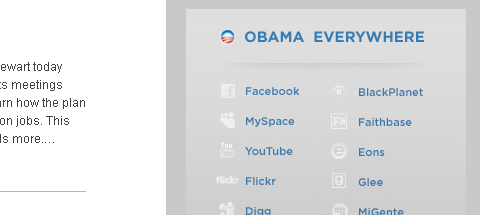
  • Barack Obama menu

White Menu - Multi-Column Menu

  • “Speaking” navigation menu

White Menu - Multi-Column Menu

  • Multi-column menu navigation

White Menu - Multi-Column Menu

White menu – vertical menu

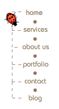
  • lace web menu

White Menu - Vertical Menu

  • Cobahair.co.uk uses only BIG typography…

White Menu - Vertical Menu

  • jBunti Hover-effect Menu

White Menu - Vertical Menu

  • Icon vertical menu

White Menu - Vertical Menu

  • nBloom menu with animation
    White Menu - Vertical Menu
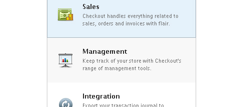
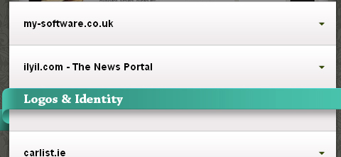
  • Checkout list-style menu

White Menu - Vertical Menu

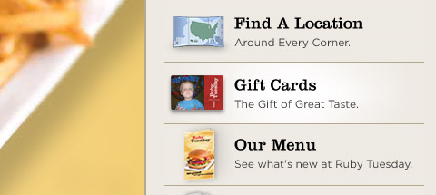
  • Ruby Tuesday slidebar menu

White Menu - Vertical Menu

  • Alexandru Cohaniuc Navigation

White Menu - Vertical Menu

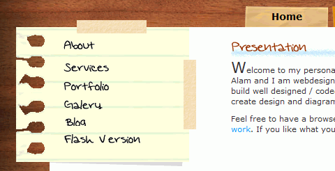
  • Web menu – handwriting style

White Menu - Vertical Menu

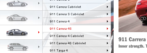
  • web menu of Porsche Canada

    White Menu - Vertical Menu

White menu refers to drop down menu which adopts white as the main color to navigate your website. As we known, white is the feasible color to match with all kinds of color, it can create wonderful visual matchable effect with other colors. Similarly, white menus are also wild navigation menu to decorate most websites of different colors. Besides color, white menus can be built in horizontal level, vertical level, tab menu, round-corner menu and multi-column. Next, let’s appreciate changable menu styles:

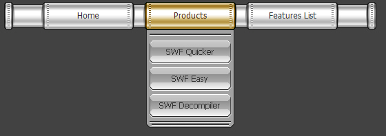
White menu – horizontal menu with black website

White Menu - Horizontal Menu

White menu – round corner menu with blue website

White Menu - Round Corner Menu

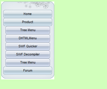
White menu – vertical menu with green website

White Menu - Vertical Menu

White menu – tab menu with yellow website

White Menu - Tab Menu

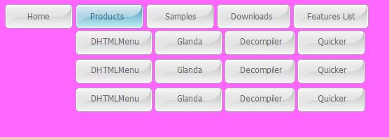
White menu – multi-column menu with purple website

White Menu - Multi-Column Menu

Auto highlight node to show where the user is on the web site. Sothink Tree Menu can automatically display the highlighted node linking to the current page in the browsers.

highlight tree menu

Introduction:

In the above tree menu, you can see that the node “Overview” is highlighted by menu font and bold style. That is because, through the analysis of tree menu, the link URL of node “Overview” is the same with “index.htm” you are visiting.

Steps:

Click Global Settings > Highlight in Tasks panel and check “Auto highlight current node” option.
The highlighted node is the same as the selected node of mouse out state when the highlight function takes efect; the highlighted node is the same as selected node of mouse over state when the mouse moves over highlighted node.

What’s DHTML tree menus?

DHTML tree menus are navigation menu used for large scale website. It also known as a links bar or link bar, which pulls down its nodes after mouse movement. It contains hypertext links on web page so as to navigate between the pages of a website, and quick link to the target page.

tree menu sampleWhy choose this DHTML menu maker?

  • Cross-browser navigation menu works excellently on main-stream browsers on various platforms.
  • Edit web menu directly in HTML editors as add-on, Dreamweaver, FrontPage included.
  • Build SE friendly navigation menu by the useful tool.
  • Publish wizard guides publishing the navigation bar, JavaScript menu to website step by step.
  • Customizes element for web menu, like font, icon, background, color, border, cursor, effects, alignment, transparency, size, etc.
  • Offers 50+ free menu templates and image library resources .
  • Any HTML code can be used within the JavaScript menu item.

DHTML menu templates

Sothink Tree Menu offers excellent menu templates by usage, and one customized type in the template gallery. You can start web menu from template; create a blank menu and apply a template to it later; and create new templates and modify the existing ones.

tree menu samples

How to make tree menus ?

Step 1: Create DHTML tree menus from built-in templates

Launch Sothink Tree Menu, “Startup” window opens, you can start menu from built-in templates or new blank. First, click the name from built-in templates to select the menu; and then, preview menu style in preview window of Startup; last, click “OK” to start menu creation.

tree menu templateStep 2: Edit nodes and replace the contents

Add or remove nodes for DHTML tree menus. The added nodes will auto-inherit the node’s properties. Replace the text and set the link for each menu item.

tree menuStep 3: Publish menu to website

Menu creation is finished. Click the button “Publish” to publish DHTML menu. After the option is check, you can follow the step to publish your navigation to website. And upload all the resources.tree menu - publish

The web designers usually apply “Cool” JS menu to navigate the website. This JS menu has the features of dynamic and interactive, which attracts the more traffic. Although JS menu is a stunning navigation menu, it is not friendly for search engine. How to make JS menu SE friendly to Google spider? Search Engine Friendly Code Maker included in Sothink DHTML Menu will help you to generate special code to make your JS menu crawled quickly by SE spider.

How to use Search Engine Friendly Code Maker?

When you finish JS menu configuration, click “Tools > Search Engine Friendly Coder Maker” or click DHTML Menu - Search Engine Code Maker on the toolbar to open Search Engine Friendly Coder Maker Dialog. The generated codes are listed within the dialog. You can click the button “Copy All” to copy these codes and then paste them into the page through web editor. These codes should be placed behind the menu code within BODY tag.

JS Menu - Search Engine Coder

The codes are like this after they are copied to the web page:

The JS menu codes are marked by green.
The generated codes by search engine friendly code maker are marked by red.

<body>
<script type=”text/javascript”>
<!–
stm_bm([“menu0e98″,800,””,”blank.gif”,0,””,””,0,0,250,0,1000,1,0,0,””,””,0,0,1,2,”default”,
“hand”,””],this);
stm_bp(“p0″,[0,4,0,0,2,3,0,7,100,””,-2,””,-2,50,0,0,”#999999″,”#E6EFF9″,””,3,1,1,”#000000″]);
stm_ai(“p0i0″,[0,”Menu Item 1″,””,””,-1,-1,0,””,”_self”,””,””,””,””,0,0,0,””,””,0,0,0,0,1,”#E6EFF9″,0,”#FFD602″,0,””,””,3,3,1,1,
“#E6EFF9″,”#000000″,”#000000″,”#000000″,”8pt Verdana”,”8pt Verdana”,0,0]);
stm_aix(“p0i1″,”p0i0″,[0,”Menu Item 2”]);
stm_aix(“p0i2″,”p0i0″,[0,”Menu Item 3″,””,””,-1,-1,0,””,”_self”,””,””,””,””,0,0,0,”arrow_r.gif”,”arrow_r.gif”,7,7]);
stm_bpx(“p1″,”p0”,[1,4,0,0,2,3,0,0]);
stm_aix(“p1i0″,”p0i0”,[]);
stm_aix(“p1i1″,”p0i1”,[]);
stm_aix(“p1i2″,”p0i0″,[0,”Menu Item 3”]);
stm_ep();
stm_aix(“p0i3″,”p0i0″,[0,”Menu Item 4”]);
stm_aix(“p0i4″,”p0i0″,[0,”Menu Item 5”]);
stm_ep();
stm_em();
//–>
</script>

<noscript>
<ul>
<li>Unspecified</li>
<li><a title=”/index.htm” href=”/index.htm” target=”_self”> Home</a>|</li>
<li><a title=”/product.htm” href=”/product.htm” target=”_self”> Products </a></li>
<li> Showcase </li>
</ul>
</noscript>

</body>

Now, the remarkable JS menu is shown on your website; and SE friendly menu code is available to make your website indexed and crawled quickly by spider.

I believe the navigation of a website should always be simple. However, if a website has many pages and sub pages, the thought of navigation simplicity goes out the window. This is where drop down menus come into play. A good and well executed drop down menu can make navigating a large site easy for the user. While drop downs make site navigation easy, sometimes they can seem difficult to implement, but the solutions listed below are all a breeze to set up, especially since most of them are built on jQuery or MooTools.

Superfish

drop down menu

jQuery SuckerFish Style

drop down menu

Smooth Navigational Menu

DHTML Menu

Animated Drop Down Menu with jQuery

navigation bar

droppy

Simple Drop Down Menu for jQuery

menu bar

UvumiTools Dropdown Menu

black menu

MooTools Drop Down Menu

web menu

MenuMatic

drop down menu

Drop-Down Menu with jQuery

menu maker

Simple CSS vertical menu Digg-like

menu builder

Drop Down Tabs

dhtml menu builder

JavaScript Dropdown Menu with Multi Levels

javascript menu

jQuery Multi Level CSS Menu #1

web menu

This is a frameset page including iframe and wonderful DHTML menu. Here displays the iframe content. Click the menu item above to see the picture in the iframe window, and you will find that the item is be activated, which the icon is shining and its background color becomes into blue.

frameset-highlight-menu

Steps:

  1. Create an iframe page in Dreamweaver.
    Select the menu item, add the linked page and Enter the frame name in the target filed in Menu Item > General.
  2. Set the icon for the menu item by type the image’ path in Menu Item Settings > Icon; set the background image in Menu Item > Background; and set the border in Menu Item > Border.
  3. Set the global properties for the whole menu. Check the option “Auto highlight current item”; set text color, Bg colcor, border color, Bg image and icon as the highlighted items style; and check “Clear highlighted item’s link” and “Highlight parent menu item” for the menu in Global > Highlight.

There are an extensive amount of roads you can take in web design, specifically in navigation. Here, we will talk about one specific navigation technique, tab-based navigation. If properly carried out, tabbed navigation can be very clean and organized within a web layout.

So what is tabbed navigation? Well, it is essentially a set of buttons most often set horizontally. Tabs generally follow numerous different styling guidelines. First, a tab set usually is attached to or slightly protrudes from a container. Also, notice how the open tab matches the background color of the container, and the other buttons are darker. This is another common styling guideline.

When you look at tabbed navigations, you will also notice many styling trends. First, many tabs will have rounded corners on buttons. This helps to create a clean look. Also helping to make a clean look is the use of separation between buttons. Most designs use space to separate buttons, but a bevel, single line, or background color contrast will also look nicely.

You will also see the use of hover effects, which is a common usability characteristic of the tabbed navigation. Gradients, radial and linear, help to achieve an impressve hover effect that brings dimension to the button that the user is selecting. Actually, you will notice that many tab buttons, selected or not, will use a slight gradient to add depth and demension to the button. This is a very simple detail often used to bring extra styling to many different user interface elements, such as buttons. The most important aspect in the design of tabbed navigation is that the active tab needs to be clear and obvious. This is what separates a tabbed navigation from an ordinary horizontal row of buttons or hyperlinks.

So, with all of that in mind, take a look at these 5 excellent tabbed-navigations shown below. Look for the trends, and follow the link to further inspect the usability of the tabbed navigation and how it looks with the rest of the design.

Veer9
These tabs have beautiful styling. Notice the use of different colors and a drop shadow for separation purposes.
tabbed menu

Wire & Twine11
This is some excellent texture use with a clean layout.
tab menu

Komodo12
A good example of tabs used in a module.
tab menu

Inkd13
Good styling and usable because of size and separation.
tab menu

Kinder-Aktuell15
Good gradient use and separation.
tab menu

Navigation menus have to be intuitive, precise and easy-to-use. One simple, basic principle, which is common for all kinds of nav bars you would ever want to use for your projects. In fact, navigation menu is probably the most important element in web design: after all, it is being used more often than any other element on a given page. Therefore it’s important to make sure that your visitors will find they way around the site structure – however complex the latter might be.

So how do designers cope with a challenging task to create an attractive and usable menu? Which results can be achieved? OK, that’s a tough one. Let’s take a look around.

Below you’ll find 8 beautiful and user-friendly Navigation Menus and solutions.

BREAKER DESIGN

nav bar

folietto

drop down menu

Pulmad, peod, lillesalong… – Annilill Peoteenindus

dhtml menu

coda.coza

drop-down menu

EGOLOUNGE *Büro für digitales Design

menu bar

Convan Design – Howdy

popup menu

far from fearless

pop up menu

Erika Greco – Blog

Nav bar is regarded as the most important element in website design because it is usually placed in the most visible location of the webpage, which makes a significant impact on the visitor’s first impression. Website designers always seek for outstanding nav bar styles to sustain the viewer’s interest. As the adage goes, “Content is king”, but getting to the content requires navigation. The modern nav bar not only needs clear-structure navigation, but also applies remarkable menu style to attract the eyes.

Nav bar generally comes in one of two orientations: vertical and horizontal. Horizontal nav bar displays items side by side; vertical nav bar stacks items on top of each other. Next, we will enjoy 15 nav bar styles of horizontal and vertical to give your more inspiration.

Horizontal nav bar with rounded corners

LemonStand
LemonStand’s primary navigation features rounded dark-gray buttons with a slight gradient.


Nav Bar - Horizontal Menu

gugafit
gugafit’s navigation buttons change to green on hover. The active item is given a dark-blue pressed look.


Nav Bar - Horizontal Menu

PeepNote
PeepNote has beige rounded buttons, with the active menu item in blue. It also uses the CSS 3 text-shadow property to add drop-shadows in most modern Web browsers.

Nav Bar - Horizontal Menu

Modern web menu

This DHTML menu is clean and popular, which is widely used for many industry. The web menu made by Sothink DHTML Menu presents us the silver and rectangle shape of menu item.

Nav Bar - Horizontal Menu

Crystal JavaScript menu
This crystal menu delivers the sense of modern, fashion and elegance. Round rectangle design gives you more imaginations – button.

Nav Bar - Horizontal Menu

Horizontal nav bar with icon

Carsonified
Carsonified uses icons to indicate the active menu item; and upon hovering over an inactive menu item, its icon is revealed.

Nav Bar - Horizontal Menu

MobileMySite.com
The company behind this website specializes in creating mobile versions of websites, so the designer made the navigation look similar to the iPhone’s UI41, making it seem familiar to first-time visitors.

Nav Bar - Horizontal Menu

RedVelvetart.com
This website features hand-drawn elements, and the navigation menu continues that theme with hand-drawn and -sketched icons above the text.

Nav Bar - Horizontal Menu

Dot JavaScript menu
Sothink DHTML Menu creates this classic red & black nav bar, the red dots work as separator to divide the menu items. When moving the mouse over the menu item, you will see the popup menu shown in line, and white dots divide the 2-level menu item.

Nav Bar - Horizontal Menu

Image DHTML menu
The image works as icon, the top icon and the bottom text together explain the usage for this menu item. Just see the image, you will know where the menu item will link to.

Nav Bar - Horizontal Menu

Vertical nav bar with various styles

Mellasat Vineyard
Mellasat Vineyard’s vertical navigation menu is a modular, one-piece design element that also contains the website name and logo. The menu is a focal element here.

Nav Bar - Vertical Menu

Utah.travel
This interactive menu has a slick slide-out menu that displays sub-links and content when a user hovers over a primary menu item.

Nav Bar - Vertical Menu

A J Miles
The portfolio of A J Miles has vertical navigation as its primary visual element. The menu is fashioned as a piece of paper held in position by tape.

Nav Bar - Vertical Menu

Notorious Design
In this navigation system, the primary links are vertically oriented. Sub-menu items come out horizontally.

Nav Bar - Vertical Menu

Envira Media Inc
This irregularly arranged menu truly embodies the website’s organic look and feel. Icons on the left of each item help with visual recognition and complement the design.

Nav Bar - Vertical Menu