Posts Tagged ‘horizontal menu’

One of the most essential part of website is Navigation Menu, Navigation Menu guides visitors how to navigate, explore and interact with the other parts (web pages) of particular website, a navigation menu should be simple and easy to understand, should not conflict the mind of visitors.

SkyTechGeek explored numerous design sites and collected 21 beautiful high quality PSD files, so that users don’t need to explore hundred of Google Pages to find out an appropriate PSD file for their design, Designers and Web developers can use them in their upcoming projects and can give their websites stunning and beautiful look.

1. Simple Navigation Menu

Read on »

Go to any website and you’re guaranteed to find one thing: a navigation menu. Navigation menus enable visitors to move from page to page; without them, we would have no way to conveniently explore websites. Perhaps this is why designers, information architects, usability researchers and user experience specialists invest so much time and resources into devising aesthetically pleasing and user-friendly navigation systems.

Website navigation menus generally come in one of two orientations: vertical and horizontal. Horizontal navigation menus display items side by side. Vertical navigation menus stack items on top of each other. In this post, we highlight some remarkable vertical navigation menus, for your inspiration.

Riot Industries
The vertical navigation in this portfolio website is simple and clean in looks yet robust in functionality and interaction. Clicking on “Web,” “Print,” or “Identity” filters the thumbnails on the right, and clicking the “About” menu item shifts the navigation to the right, making way for content on the left.

navigation menu

vertical

Village Version
Here, you can see one of the benefits of vertical navigation: it allow for highly compact and modular menus that appear distinct from the rest of the layout. Sitting in the top-left corner, just below the website’s name, the menu is one of the first things visitors see (at least with left-to-right languages).

Bruno Souza
This portfolio has a clean and simple navigation design that leaves the visitor to focus on the vibrant content to the right.

Cambrian House
A quite distinctive, original navigation menu with five different typefaces. A bit unusual navigation for a crowdsourcing community.

Comfort Brothers
Navigation menu on the right side of the layout for a change: although the design is basic, almost rudimentary, it works well and is easy to navigate. Navigation menus do not have to look outstanding.

Auberge de l’Ill
This vertical navigation design is elegant and functional. Hovering over a menu item triggers a horizontal animation.

The Hipstery!
This website’s vertical navigation sits right in the middle of where the visitor is focusing when the page first loads. Active menu items are denoted by a pointing hand.

Research at MICA
The navigation design for the Maryland Institute College of Arts demonstrates another advantage of vertical navigation: it shows hierarchy and allows you to group menu items without resorting to drop-down menus, whose sub-menus are displayed only when the user mouses over an item.

Power to the Poster
The vertical navigation design on this website is positioned right below the website’s name, making it prominent without drawing attention from the large rotating banner in the top-right.

From the Couch
The vertical navigation here shows yet another benefit: being able to accommodate more menu items.

White menu refers to drop down menu which adopts white as the main color to navigate website. As we known, white is the feasible color to match with all kinds of color, it can create wonderful visual matchable effect with other colors. Similarly, white menus are also wild navigation menu to decorate most websites of different colors. Besides color, white menus can be built in horizontal level, vertical level, tab menu, round-corner menu and multi-column menu. Next, let’s appreciate changeable menu styles:

White menu – horizontal menu

  • Special menu designed by Jason Reed Web

White Menu - Horizontal Menu

  • Gotmilk Flash menu

White Menu - Horizontal Menu

  • Web menu designed by Jeremy Levine

White Menu - Horizontal Menu

  • Maxandlous.com unusual menu

White Menu - Horizontal Menu

  • JavaScript menu with handwring style

White Menu - Horizontal Menu

  • Web menu with button style

    White Menu - Horizontal Menu

  • DHTML Menu for Jayme Blackmon

White Menu - Horizontal Menu

  • Alex Buga menu

White Menu - Horizontal Menu

  • Water’s Edge Media web menu

White Menu - Horizontal Menu

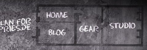
  • Ronnypries.de navigation menu

White Menu - Horizontal Menu

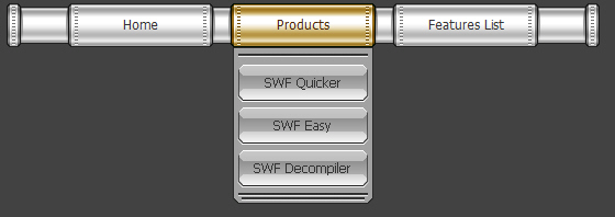
  • Pipe DHTML menu

White Menu - Horizontal Menu

White menu – round corner menu

  • Round style menu with mouse over

White Menu - Round Corner Menu

  • Silver round corner menu

White Menu - Round Corner Menu

White menu – tab menu

  • Silver tab menu

White Menu - Tab Menu

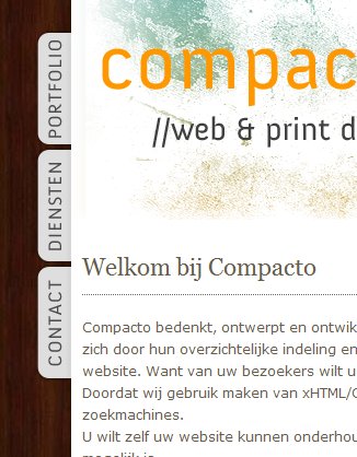
  • Vertical tab menu

White Menu - Tab Menu

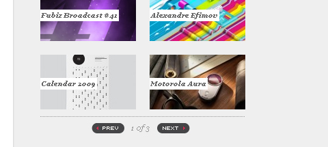
  • Fubiz slidebar

White Menu - Tab Menu

  • Great FreelanceSwitch menu

White Menu - Tab Menu

White menu – multi-column menu

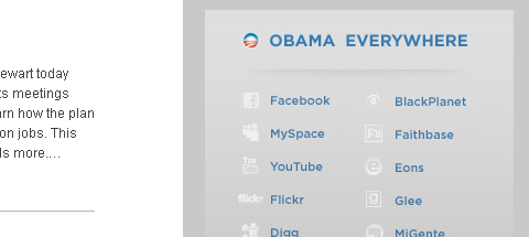
  • Barack Obama menu

White Menu - Multi-Column Menu

  • “Speaking” navigation menu

White Menu - Multi-Column Menu

  • Multi-column menu navigation

White Menu - Multi-Column Menu

White menu – vertical menu

  • lace web menu

White Menu - Vertical Menu

  • Cobahair.co.uk uses only BIG typography…

White Menu - Vertical Menu

  • jBunti Hover-effect Menu

White Menu - Vertical Menu

  • Icon vertical menu

White Menu - Vertical Menu

  • nBloom menu with animation
    White Menu - Vertical Menu
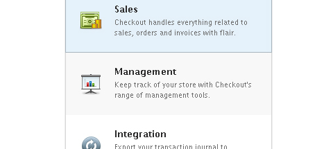
  • Checkout list-style menu

White Menu - Vertical Menu

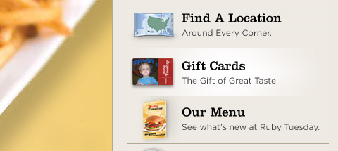
  • Ruby Tuesday slidebar menu

White Menu - Vertical Menu

  • Alexandru Cohaniuc Navigation

White Menu - Vertical Menu

  • Web menu – handwriting style

White Menu - Vertical Menu

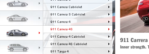
  • web menu of Porsche Canada

    White Menu - Vertical Menu

White menu refers to drop down menu which adopts white as the main color to navigate your website. As we known, white is the feasible color to match with all kinds of color, it can create wonderful visual matchable effect with other colors. Similarly, white menus are also wild navigation menu to decorate most websites of different colors. Besides color, white menus can be built in horizontal level, vertical level, tab menu, round-corner menu and multi-column. Next, let’s appreciate changable menu styles:

White menu – horizontal menu with black website

White Menu - Horizontal Menu

White menu – round corner menu with blue website

White Menu - Round Corner Menu

White menu – vertical menu with green website

White Menu - Vertical Menu

White menu – tab menu with yellow website

White Menu - Tab Menu

White menu – multi-column menu with purple website

White Menu - Multi-Column Menu

Nav bar is regarded as the most important element in website design because it is usually placed in the most visible location of the webpage, which makes a significant impact on the visitor’s first impression. Website designers always seek for outstanding nav bar styles to sustain the viewer’s interest. As the adage goes, “Content is king”, but getting to the content requires navigation. The modern nav bar not only needs clear-structure navigation, but also applies remarkable menu style to attract the eyes.

Nav bar generally comes in one of two orientations: vertical and horizontal. Horizontal nav bar displays items side by side; vertical nav bar stacks items on top of each other. Next, we will enjoy 15 nav bar styles of horizontal and vertical to give your more inspiration.

Horizontal nav bar with rounded corners

LemonStand
LemonStand’s primary navigation features rounded dark-gray buttons with a slight gradient.


Nav Bar - Horizontal Menu

gugafit
gugafit’s navigation buttons change to green on hover. The active item is given a dark-blue pressed look.


Nav Bar - Horizontal Menu

PeepNote
PeepNote has beige rounded buttons, with the active menu item in blue. It also uses the CSS 3 text-shadow property to add drop-shadows in most modern Web browsers.

Nav Bar - Horizontal Menu

Modern web menu

This DHTML menu is clean and popular, which is widely used for many industry. The web menu made by Sothink DHTML Menu presents us the silver and rectangle shape of menu item.

Nav Bar - Horizontal Menu

Crystal JavaScript menu
This crystal menu delivers the sense of modern, fashion and elegance. Round rectangle design gives you more imaginations – button.

Nav Bar - Horizontal Menu

Horizontal nav bar with icon

Carsonified
Carsonified uses icons to indicate the active menu item; and upon hovering over an inactive menu item, its icon is revealed.

Nav Bar - Horizontal Menu

MobileMySite.com
The company behind this website specializes in creating mobile versions of websites, so the designer made the navigation look similar to the iPhone’s UI41, making it seem familiar to first-time visitors.

Nav Bar - Horizontal Menu

RedVelvetart.com
This website features hand-drawn elements, and the navigation menu continues that theme with hand-drawn and -sketched icons above the text.

Nav Bar - Horizontal Menu

Dot JavaScript menu
Sothink DHTML Menu creates this classic red & black nav bar, the red dots work as separator to divide the menu items. When moving the mouse over the menu item, you will see the popup menu shown in line, and white dots divide the 2-level menu item.

Nav Bar - Horizontal Menu

Image DHTML menu
The image works as icon, the top icon and the bottom text together explain the usage for this menu item. Just see the image, you will know where the menu item will link to.

Nav Bar - Horizontal Menu

Vertical nav bar with various styles

Mellasat Vineyard
Mellasat Vineyard’s vertical navigation menu is a modular, one-piece design element that also contains the website name and logo. The menu is a focal element here.

Nav Bar - Vertical Menu

Utah.travel
This interactive menu has a slick slide-out menu that displays sub-links and content when a user hovers over a primary menu item.

Nav Bar - Vertical Menu

A J Miles
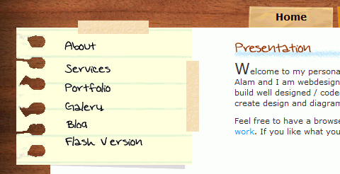
The portfolio of A J Miles has vertical navigation as its primary visual element. The menu is fashioned as a piece of paper held in position by tape.

Nav Bar - Vertical Menu

Notorious Design
In this navigation system, the primary links are vertically oriented. Sub-menu items come out horizontally.

Nav Bar - Vertical Menu

Envira Media Inc
This irregularly arranged menu truly embodies the website’s organic look and feel. Icons on the left of each item help with visual recognition and complement the design.

Nav Bar - Vertical Menu

A website is like a magazine where people search for information. The table of contents of a magazine is like the navigation of a website. Table of contents provides an overview of your magazine, while navigation also shows on what your viewers should expect to see on your website. Both serves as pathways for your viewers on how they can explore your website.
Whenever I think of what is the most important task a web designer could do, I always end up thinking that it should be the creation of good navigation. It must be well-designed in a user-friendly manner that the moment the viewer sees it, they instantly understand how it is used and what is it for. A navigation must also be creatively done, it is one of the elements you can find on a website where you can capture a viewer’s attention.

What’s kind of menus is good for web navigation?

The less click, the better.

Viewers tend to be impatient when searching for information; they want to seek what they are searching very quickly. Make sure that your navigation responds as quickly as possible to your viewers’ instincts.

Horizontal Navigation Menu

Horizontal navigation is the widely used navigation of web designers today. Usually, the navigation bar is placed right under the header.

Good Characteristics:
1. It occupies less space
Horizontal navigation is mostly used by web designers for it occupies less space, because it is placed at the top part of the website. Then, the rest of the spaces you can use for your content.

2. More noticeable
Our eyes first notice elements of the website that are placed on the center, that is why horizontal menus are more noticeable since they are placed on the top and center part of the website.

3. Easier to use
Viewers find horizontal navigation easier to use. Comparing it to vertical navigation, you still have to move your mouse pointer on the left part of the screen (or sometimes right) to click the menus. If the navigation is horizontally placed, you just have to move your pointer upward to click a menu button.

4. Viewers are already used to it
Since it is the mostly used navigation, viewers always expect that all websites have this type of navigation.

Bad Characteristics:

1. Limited space for your menus
When using horizontal navigation, you are limited on the width space of your website and this still depends on the layout of your website.

2. Can only be used if number of menus are already known
Horizontal navigation can only be used if the number of your menus is already fixed, because the size and design depends on the number of menus to be placed.

View Horizontal Navigation Menu Samples for Inspiration:

Main Navigation Types & Usability
Main navigation, also known as global navigation (if the navigation is always present on each page) is a crucial element for web site or web-based application usability. There are many variations of main navigation systems, however for the vast majority of existing web sites or web-based applications* there are four primary types:

  • Horizontal Menu
  • Vertical Menu
  • Inverted
  • Mega Footer

Which main navigation system is used depends on several variables, including;

  • Information architecture of the site
  • Screen size or typical location of use of the web site
  • User needs including any special accessibility issues

The screen size issue is a very important consideration now that more and more users rely on mobile devices to find and access content and functionality.  With mobile screen size being extremely limited vs. typical displays in homes or offices, It is important to consider which type of main navigation will work best for each environment.
The main navigation type chosen will have a direct and significant impact on the usability of a web site, and because of this great care should be taken before deciding on a navigation type. From a usability standpoint, there are multiple benefits and challenges for each primary type of navigation.
Main Navigation– Horizontal Menu
Horizontal menus have links placed across the page, well, horizontally. This has a tendency to work well for Western cultures, in which reading from left to right, top to bottom is the norm. Horizontal menus align with Western users’s expectations for important content being at the top of a page.

First level horizontal menu items Subject 1, Subject 2, Subject 3
Typically horizontal menu bars are located at the top of the page, but there are several notable exceptions to this rule, including the home page of Blogger.com, which has the main navigation at the bottom of the page.

Blogger.com home page horizontal main navigation is located at the bottom of the page.

This article is from usefulusability.com

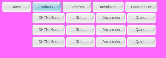
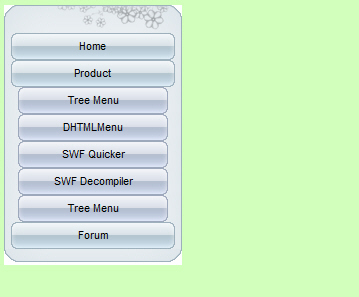
Sothink DHTML Menu groups many excellent drop down menu samples since it comes out. With the development of JavaScript menu builder, menu samples are more and more beautiful; and their functions are more and more powerful. Let’s view some classic menu samples from DHTML Menu builder:

Horizontal Menu:

Vertical Menu: