Archive for the ‘articles’ Category
Link building has been in existence ever since search engine optimisation was developed. It was once the primary concern of SEO specialists. Teams were created to do nothing but come up with a multitude of links for a site to earn it a higher rank in search results. To obtain these links, “link specialists” had to contact website owners to exchange links or to buy them.
It’s said that you only get one chance to make a first impression. When it comes to your web design, that chance measures out to about 2.6 seconds, according to researchers. It takes about that long for an internet user’s eyes to go the specific area of a website that influences their first impression.
Image Credit: fotolia.com
Eye Tracking Study Results Where Users Focus Most
The results of a study conducted at Missouri University of Science and Technology revealed that internet users spend less than three seconds scanning a website before they focus on a particular section. Then they spend an average of 180 milliseconds (0.18 seconds) focusing on one particular section before making a decision about whether to move on.
If the website doesn’t load in two seconds or less, chances are very good that the internet user will not come back to your site. They will simply click away and move on to a different one.
If your website is on a shared hosting plan, your site’s loading speed may be effected if a co-owner experiences a large spike in traffic. Other sites may find that their loading speed is slower as a result. You don’t necessarily have to spend a lot of money to get a good hosting plan; it makes sense to compare sites and find the cheapest web hosting plan that will give you the features you need at the best price.

Markup is a beautiful thing, and it certainly has changed over the years. What was effectively HTML1, has certainly progressed to an amazing semantic markup language, to which we can largely thank the W3C. And, what do ya know, the next thing to thank them for has come about – HTML5.
Unlike previous version of HTML, where the code was mostly a limited structure that was determined by how you made use of the class and ID elements, html5 really attempts to provide much more structure.
All of the layout can be created with semantic tags and elements that determine how you should structure, and, arguably more important, that help you structure each page. This produces code that is much more clean and readable than in previous versions of HTML, and really is something quite amazing. The new tags really require that you think about how you are structuring your page, which let’s be honest – in the end that is a great thing for us web designers and developers alike.
Before understanding the structure of HTML5, and how to create and code an example template to use for your projects you should be aware of how it came about. Be aware though that the current version of HTML5 has not reached a version that the W3C could call final as of yet, but their is quite a lot to learn about and start using in your code right now. Here is what the W3C has to say on this issue: Read on »
Like fashion world, the excellent web designers also eager to find creative ways to make their work more remarkable by exploring new possibilities and apply variations with existing or new web design trends. From either year 2011 or the several months past in 2012, we can easily notice how people design.
Since Elliot Jay Stocks so poignantly told us to destroy the Web 2.0 look, we’ve witnessed a de-shinification of the Web, with fewer glass buttons, beveled edges, reflections, special-offer badges, vulgar gradients with vibrant colors and diagonal background patterns. The transformation has been welcomed with relief by all but the most hardened gloss-enthusiasts. However, design and aesthetics work in mysterious ways, and no sooner does one Web design trend leave us before another appears.
The Symptoms
So, exactly what is this new epidemic? Well, let’s start by looking at some of the most common symptoms, many of which you have probably noticed. They are easy to spot, and as with many other conditions, they often appear in conjunction with each other. (This is why the contagion spreads so effectively — seemingly independent symptoms grow more infectious when combined with others.)
Please note: The following list appears in no particular order and does not indicate the level of infectiousness or severity, which seem to be stable across the board. Note also that the instances given often exhibit more than one symptom, making classification more difficult.
Stitching
Stitching appears gradually, often as a result of the designer playing too long with borders and lines, particularly of the dotted variety. A full-blown stitch is evidenced by the subtle shift from dots to dashes, augmented by drop shadows and other effects to give the impression of 3-D. The purpose of the stitch is somewhat elusive, but it seems to thrive in environments where certain textures are applied, most notably fabric and leather, but also generic graininess.
While determining the exact cause of stitching is difficult, scientists are certain that it belongs to a larger strain of the infection known as “Skeuomorphism.”
The navigation menu is the most important element for a website, either in appearance and usability. The web menu designers are trying their best to make the menu more appealing and functional for the visitors easily find what they want. A bad navigation menu will make the visitors feel lost in the site. Here I collect some creative website navigation menus for you to find some inspirations of making your own.
Creative Flu

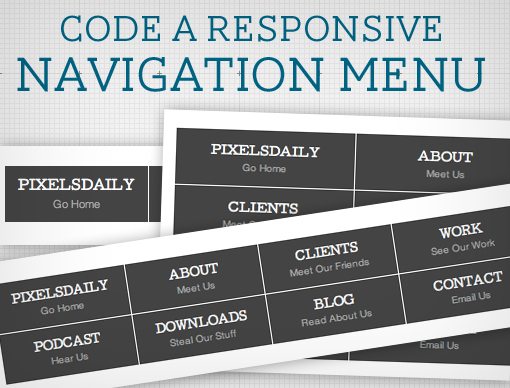
Navigation menus used to be a fairly simple thing. Code up an unordered list, float it left and you’re good to go. With responsive design being all the rage these days though you’re faced with some new challenges when creating a menu design.
Follow along as we start from scratch and code a simple but effective responsive navigation menu that you can easily modify and reuse in your own projects.
What We’re Building
If you’re the kind of person who likes to skip ahead, here’s a sneak peek at what we’re building. Be sure to resize your browser window to see the responsive concepts in action. Read on »
Often used on e-commerce and large scale web sites, the mega menus become more popular in modern web design. They are a great and effective way to display large amount of content on your website while you keep a nice and clean layout.
With mega menu you will be able to improve the navigation and usability on your web sites. In this article I will show you some premium CSS only mega menus and the best features that each one has to offer.
Facebook might not have all the glittery text and obnoxious backgrounds that MySpace has, but it still has its fair share of useless apps.
This is especially true if you have ever tried to search for creative Facebook apps or those that may be of interest to creative people.
If you have ever searched for such a thing, you have no doubt realized that there is an abundance of useless apps. This is the reason that I went through just about every app on Facebook to find the very few that were best suited for creative individuals, or had some sort of visual flair about them.
So here are 25 awesome Facebook applications that most designers will enjoy in their Facebook pages.
1. Addicted to Photoshop
This is a neat app brought to you by the master minds behind the “Sheezy” sites (Brusheezy, Flasheezy, etc).
“Photoshop Brush Junkies Rejoice! Get your daily fix of new Photoshop brushes and patterns from Brusheezy.com!”
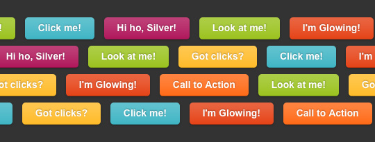
CSS3 is changing how we build websites. Even though many of us are still reluctant to start using CSS3 due to the lack of support in some browsers, there are those out there that are moving forward and doing some amazing stuff with its cool new features. No longer will we have to rely on so much JavaScript and images to create nice looking website elements such as buttons and menu navigations. So, in order to encourage you to start experimenting with CSS3, we’ve rounded up 12 excellent CSS3 button and menu techniques.


 Buy or sell a logo
 iOS Data Recovery
 Mobile Data Transfer