Successful, eye-catching and mainly user-friendly site navigation sometimes is key to whole web design, because users usually search for navigation at first, when they visit website. Also don’t shy to experiment – portfolio websites can stand out just by that, creating something beautiful and unusual. In our days there are times when whole websites slide over your eyes, possibilities are pretty limitless. Keeping in mind such parameters, I created a list with 10 innovative, beautiful, creative and eye-catching navigation menus for your inspiration in web development process.

  1. Panic – Coda
  2. Popular menu already, you may know about this one before.

  3. Helmy-Bern
  4. Excellent example of well implemented grunge website and JavaScript navigation

  5. SkiAlpine
  6. Simple yet well designed navigation dropdown menu.

  7. TapTapTap
  8. Exceptional navigation, you gonna love this one.

  9. TheHoleInOurGospel

  10. Apple
  11. Whole website is one big beauty and MAC section has interesting sliding menu.

  12. Creasenso
  13. Beautiful rollover effects in navigation.

  14. Branded07

  15. Aperfolio

  16. AteBits

Creating rounded corner in web design absolutely not a new thing, but with the presence of CSS3 in popular browser like Firefox, Chrome, Safari, and Opera, now is easier for us to creating rounded corner, sometimes I remember before when I need to add an image in each corner of the box, what a frustrating. Untill these day many websites still using it as a main navigation style, even in the corporate website, and some of more simple websites their menu style inspired by apple.

Mozilla Firefox

drop down menuOracle

dhtml menuApple

web menuRoxio

drop down menuReal Mac Software

web menugOSweb menuSkype

dhtml menuLoop Insight

menu builder

google navigation bar

Google’s new cross-site navigation bar, which began rolling out, is actually a new measure to improve your surfing privacy, and not the ‘Google +1? social layer that we’ve been anticipating.

Basically, the bar elucidates the three ‘states’ in which you can use Google’s services. First this is ‘Unidentified,’ which is where Google only knows your IP address, tracks you with a cookie, but doesn’t know your name; then there’s ‘Psuedonymous,’ which is how most of us currently use Google — and finally there’s ‘Identified,’ which is where your real life identity is assured.

Interestingly, Google also answers a question we’ve always wondered about: when you’re logged out, you are effectively anonymous — even if your IP address matches one of your Google accounts, your surfing habits are still kept separate.

The navigation bar, then, is simply a way of making sure you always know just how private (or public) your actions are. It’s worth noting that the nav bar might still become a part of the upcoming ‘+1? social layer — but for the time being, we can only guess at how they might be combined.

Article from: http://my-very-cool-gadgets.com/

On websites that have a lot of pages, breadcrumb navigation can greatly enhance the way users find their way around. In terms of usability, breadcrumbs reduce the number of actions a website visitor needs to take in order to get to a higher-level page, and they improve the findability of website sections and pages. They are also an effective visual aid that indicates the location of the user within the website’s hierarchy, making it a great source of contextual information for landing pages.

What is a breadcrumb?

A “breadcrumb” (or “breadcrumb trail”) is a type of secondary navigation scheme that reveals the user’s location in a website or Web application. The term comes from the Hansel and Gretel fairy tale in which the two title children drop breadcrumbs to form a trail back to their home. Just like in the tale, breadcrumbs in real-world applications offer users a way to trace the path back to their original landing point.

navigation menu

You can usually find breadcrumbs in websites that have a large amount of content organized in a hierarchical manner. You also see them in Web applications that have more than one step, where they function similar to a progress bar. In their simplest form, breadcrumbs are horizontally arranged text links separated by the “greater than” symbol (>); the symbol indicates the level of that page relative to the page links beside it.

In this article, we’ll explore the use of breadcrumbs on websites and discuss some best practices for applying breadcrumb trails to your own website.

When Should You Use Breadcrumbs?

Use breadcrumb navigation for large websites and websites that have hierarchically arranged pages. An excellent scenario is e-commerce websites, in which a large variety of products is grouped into logical categories.

You shouldn’t use breadcrumbs for single-level websites that have no logical hierarchy or grouping. A great way to determine if a website would benefit from breadcrumb navigation is to construct a site map or a diagram representing the website’s navigation architecture, and then analyze whether breadcrumbs would improve the user’s ability to navigate within and between categories.

Breadcrumb navigation should be regarded as an extra feature and shouldn’t replace effective primary navigation menus. It’s a convenience feature; a secondary navigation scheme that allows users to establish where they are; and an alternative way to navigate around your website.

Types of Breadcrumbs

Location-based
Location-based breadcrumbs show the user where they are in the website’s hierarchy. They are typically used for navigation schemes that have multiple levels (usually more than two levels). In the example below (from SitePoint), each text link is for a page that is one level higher than the one on its right.

navigation menuAttribute-based
Attribute-based breadcrumb trails display the attributes of a particular page. For example, in Newegg, breadcrumb trails show the attributes of the items displayed on a particular page:

dhtml menu

This page displays all computer cases that have the attributes of being manufactured by Lian Li and having a MicroATX Mini Tower form factor.

Path-based
Path-based breadcrumb trails show users the steps they’ve taken to arrive at a particular page. Path-based breadcrumbs are dynamic in that they display the pages the user has visited before arriving on the current page.

Benefits of Using Breadcrumbs

Here are just some of the benefits of using a breadcrumb trail.

Convenient for users
Breadcrumbs are used primarily to give users a secondary means of navigating a website. By offering a breadcrumb trail for all pages on a large multi-level website, users can navigate to higher-level categories more easily.

Reduces clicks or actions to return to higher-level pages
Instead of using the browser’s “Back” button or the website’s primary navigation to return to a higher-level page, users can now use the breadcrumbs with a fewer number of clicks.

Doesn’t usually hog screen space
Because they’re typically horizontally oriented and plainly styled, breadcrumb trails don’t take up a lot of space on the page. The benefit is that they have little to no negative impact in terms of content overload, and they outweigh any negatives if used properly.

Reduces bounce rates
Breadcrumb trails can be a great way to entice first-time visitors to peruse a website after having viewed the landing page. For example, say a user arrives on a page through a Google search, seeing a breadcrumb trail may tempt that user to click to higher-level pages to view related topics of interests.

Breadcrumb Navigation Design Considerations

When designing a breadcrumb navigation scheme, keep several things in mind. Let’s take a look at some questions that might arise when you’re working with breadcrumbs.

What should be used to separate link items?
The commonly accepted and most recognizable symbol for separating hyperlinks in breadcrumb trails is the “greater than” symbol (>). Typically, the > sign is used to denote hierarchy, as in the format of Parent category > Child category.

Article Scource: http://www.smashingmagazine.com/

Go to any website and you’re guaranteed to find one thing: a navigation menu. Navigation menus enable visitors to move from page to page; without them, we would have no way to conveniently explore websites. Perhaps this is why designers, information architects, usability researchers and user experience specialists invest so much time and resources into devising aesthetically pleasing and user-friendly navigation systems.

Website navigation menus generally come in one of two orientations: vertical and horizontal. Horizontal navigation menus display items side by side. Vertical navigation menus stack items on top of each other. In this post, we highlight some remarkable vertical navigation menus, for your inspiration.

Riot Industries
The vertical navigation in this portfolio website is simple and clean in looks yet robust in functionality and interaction. Clicking on “Web,” “Print,” or “Identity” filters the thumbnails on the right, and clicking the “About” menu item shifts the navigation to the right, making way for content on the left.

navigation menu

vertical

Village Version
Here, you can see one of the benefits of vertical navigation: it allow for highly compact and modular menus that appear distinct from the rest of the layout. Sitting in the top-left corner, just below the website’s name, the menu is one of the first things visitors see (at least with left-to-right languages).

Bruno Souza
This portfolio has a clean and simple navigation design that leaves the visitor to focus on the vibrant content to the right.

Cambrian House
A quite distinctive, original navigation menu with five different typefaces. A bit unusual navigation for a crowdsourcing community.

Comfort Brothers
Navigation menu on the right side of the layout for a change: although the design is basic, almost rudimentary, it works well and is easy to navigate. Navigation menus do not have to look outstanding.

Auberge de l’Ill
This vertical navigation design is elegant and functional. Hovering over a menu item triggers a horizontal animation.

The Hipstery!
This website’s vertical navigation sits right in the middle of where the visitor is focusing when the page first loads. Active menu items are denoted by a pointing hand.

Research at MICA
The navigation design for the Maryland Institute College of Arts demonstrates another advantage of vertical navigation: it shows hierarchy and allows you to group menu items without resorting to drop-down menus, whose sub-menus are displayed only when the user mouses over an item.

Power to the Poster
The vertical navigation design on this website is positioned right below the website’s name, making it prominent without drawing attention from the large rotating banner in the top-right.

From the Couch
The vertical navigation here shows yet another benefit: being able to accommodate more menu items.

Here at Design Shack we love a good navigation menu. Lately we’ve noticed a trend arising around menus that use icons either exclusively in place of text or as a support of additional textual information.

Adding icons to your navigation can not only give you an aesthetic boost but actually make for a quicker visual read of the link. Here’s a collection of over thirty icon-based navigation menus that we found online. We’ll conclude with a few resources you can use to snag some free icons to create your own fancy menus.

KK Media

dhtml menu

Bite Club

icon navigation menu

Mac Rabbit

drop down menuNarwhal Company

icon menu

Pixel Resort

navigation bar

Fishing Cactus

drop down menu

Tutorial 9

tab menu

Envira Media

javascript menu

Duarte Pires

horizontal menu

Weblifting

A good navigation would mean that you have a user-friendly website. And if you have a user-friendly website, expect that your online visitors would be comfortable browsing your site and would definitely come back for more visits. Come to think of it, where would you like to stay longer? In a website where you have to click on the sitemap every time your browse or in a website where you can easily find what you are looking for with just a few clicks?

Here are great navigation tips on how to make your website design user-friendly:

A clean website with a good navigation is always a plus. You can enhance the look of your website with graphics but make sure that you focus on your content and use a lot of white space. If you are to create links to a content site, you can use contrasting colors.

Do not clutter links. Make sure that you organize your links and they are all working.

Dead links can give an impression of sloppiness and haphazard work? If you have too many links, you can categorize them accordingly in drop down menus. You can also use flyouts links for your main categories.

Create a navigation system that is consistent and clean-cut. If you have your links on a drop down menu under one category, then you must have the same navigation with the rest of your site categories.

Your website design should accommodate a large number of links as you may have to add links in the future. As you add more pages to your site, then you need to add more space for additional links.

Categorize your website content in sections so you can gather up related links. You can use section home pages for certain categories or sections.

Your main links should be kept together.
This way, your visitors can know what your website covers at just one glance. The links to your site’s main sections should convey what your website is all about. If it is a business website- your main links should show what products or services you have to offer.? Links can be placed on navigations bars. They are often listed on the right side of the menu bar. You can also line them up neatly, just below your header.

In creating text links for your website, have it short and simple. The words should precise enough to know what that page would contain once clicked.

If you think a link is important to your reader or if you want them to go to a certain section in your site, you can make this link as a feature link of your site. You can have a different front color for this special link, boxed it up or have it in bold font.

Article source: http://business.ezinemark.com/

JQuery is a most useful component that can giving your visitor unique experience in a variety of ways, like image sliders, show your twitter stream, image galleries, navigation menu and contact forms.

jQuery menuIn this post you’ll find 15 really amazing jQuery navigation menu in tutorials and premium scripts, which will help you to create a navigation menu of your dreams.

Tutorials of Amazing jQuery Navigation Menu

Rocking and Rolling Rounded Menu with jQuery

jQuery menuby Mary Lou
In this tutorial we are going to make use of the incredibly awesome rotating and scaling jQuery patch from Zachary Johnson that can be found here. We will create a menu with little icons that will rotate when hovering. Also, we will make the menu item expand and reveal some menu content, like links or a search box.

Halftone Navigation Menu With jQuery & CSS3

jQuery menuby Martin Angelov
Today we are making a CSS3 & jQuery halftone-style navigation menu, which will allow you to display animated halftone-style shapes in accordance with the navigation links, and will provide a simple editor for creating additional shapes as well.

Beautiful Slide Out Navigation- A CSS and jQuery Tutorial

navigation menuby Mary Lou
Today I want to show you how to create an amazing slide out menu or navigation for your website. The navigation will be almost hidden – the items only slide out when the user hovers over the area next to them. This gives a beautiful effect and using this technique can spare you some space on your website. The items will be semi-transparent which means that content under them will not be completely hidden.

How To Create a Cool Animated Menu with jQuery

drop down menuby Chris Spooner
In this tutorial we’ll be building a cool navigation list complete with a sliding hover effect. Learn how to build the concept in Photoshop, lay out the basic HTML elements, style everything up in CSS then tie it all together with a few lines of jQuery to create a semantic, accessible and degradable menu design.

Beautiful Background Image Navigation with jQuery

web menuby Mary Lou
In this tutorial we are going to create a beautiful navigation that has a background image slide effect. The main idea is to have three list items that contain the same background image but with a different position. The background image for each item will be animated to slide into place in different times, creating a really nice effect. The background image sliding direction from the list item in the middle will depend on which item the user was before: coming from the right, it will slide from the left and vice versa.

Animated Navigation with CSS & jQuery

navigation barby Soh Tanaka
As I was checking out some flash sites for inspiration, I ran across a couple websites that had some nice navigation effects. I’m not a huge fan of wildly animated navs, but these had simple and elegant roll over effects that I liked. I decided to imitate the effect with CSS and jQuery, and would like to share this technique today.

A Fresh Bottom Slide Out Menu with jQuery

javascript menuby Mary Lou
In this tutorial we will create a unique bottom slide out menu. This large menu will contain some title and a description of the menu item. It will slide out from the bottom revealing the description text and some icon. We will use some CSS3 properties for some nice shadow effects and jQuery for the interaction.

How to Make a Smooth Animated Menu with jQuery

menu makerby Zach Dunn
Ever seen some excellent jQuery navigation that left you wanting to make one of your own? Today we’ll aim to do just that by building a menu and animate it with some smooth effects.

Overlay Effect Menu with jQuery

drop down menu makerby Mary Lou
In this tutorial we are going to create a simple menu that will stand out once we hover over it by covering everything except the menu with a dark overlay. The menu will stay white and a submenu area will expand. We will create this effect using jQuery.

CSS Dock Menu

menu creatorby Nick La
If you are a big Mac fan, you will love this CSS dock menu. It is using Jquery library and Fisheye component from Interface and some of my icons. It comes with two dock position: top and bottom.

Little Boxes Menu with jQuery

menu builderby Mary Lou
Today we will create a menu out of little boxes that animate randomly when a menu item is clicked. The clicked menu item expands and reveals a content area for some description or links. When the item is clicked again, the boxes will come back, reconstructing the initial background image.

Premium jQuery Scripts for Cute Menu Navigation

SV Animated Menu Pack 2

dhtmk menuby SplitV
This is a set of 4 animated menu scripts. All are stand alone, requiring no external libraries or frameworks. They are extremely small at 1-2kb a piece uncompressed. If you compress them they are all closer to 1-1.5kb. These scripts make it possible to create great menus with flash like effects very easily.

Nice Menu V1.0

menu makerby Alexandra1710
A new way to slide between 2 level huge menu.
easy to use, valid html and css code
works in all majors browsers
easy to plug and play script to your website / blog or gallery

Super menu pack (10 menus)

js menu

by VanKarWai
Super menu pack is a collection of 10 cool menus, 5 in pure css and 5 using jQuery framework for customize or layout with your websites or applications and projects.

It’s perfect for anyone who wants to give a special touch to their designs or find a starting point. I tried to create a collection as varied as possible in style and appearance to give you choice. Thinking in design working with code.

Cute Menu – 8 transitions pack

horizontal menuby arl1nd
Cute Menu is very simple to embed to your HTML code. It’s requirements are only JavaScript and CSS support.

Article source: http://www.dynamicwp.net/

Google always come up with some design or layout changes to improve Search Experience. This time, the navigation bar present on the top of homepage and search result page is redesigned and the bar will show your name instead of the email ID. The redesigned navigation bar is having the same navigation links like Web, Images, Videos, Maps, News, Shopping, Gmail and More on left side, but the right side of the bar is changed. Earlier the right side of the bar was showing iGoogle, Search Settings and Sign In links, but now only Sign In and a settings icon is there.

Note: Redesigned navigation bar is available on Google.com only.

navigation menunavigation link

You can sign in using Google account by clicking on the “Sign In” link. The settings icon will show you options like “Search Settings, iGoogle and Privacy” without signed in. Once you will sign in with Google account, your name will appear on the right side of the bar and email ID will be visible only after clicking on the name. You can browse the list of subscribed services from “Settings Icon ==> Account Settings” which is available in the right most of the bar.

The redesigned bar is giving Google homepage and SERP much cleaner and improved look. What is your opinion on that? Share your thoughts on the new redesigned navigation bar of Google.

Pop up menu is visible and placed on the top for majority websites. For some websites, the web designers want to navigate the website by DHTML menu, but there is no space to place menu, context menu type is the best choice to show menu and it can be shown anywhere just by right-clicking.pop-up-menu
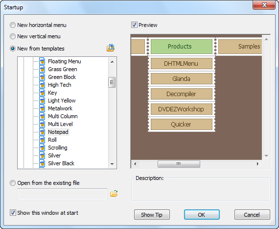
Step 1: Create pop up menu from built-in templates

Launch Sothink DHTML Menu, “Startup” window opens, you can start menu from built-in templates or new blank. First, click the name from built-in templates to select the menu; and then, preview menu style in preview window of Startup; last, click “OK” to start menu creation.

Pop up Menu - Menu Template

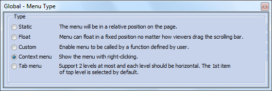
Step 2: Choose menu type for the chosen menu

In tasks panel, click “Menu Type” option on the Global panel; and enter the “Global > Menu Type” to set the menu as “Context menu”.

Pop up Menu - Menu Type

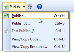
Step 3: Publish menu to website

Menu creation is finished. Click the button “Publish” to choose the best publishing method. After the option is check, you can follow the step to publish your navigation to website. And upload all the resources.

Pop up Menu - Publish Menu