Posts Tagged ‘navigation’

One of the most essential part of website is Navigation Menu, Navigation Menu guides visitors how to navigate, explore and interact with the other parts (web pages) of particular website, a navigation menu should be simple and easy to understand, should not conflict the mind of visitors.

SkyTechGeek explored numerous design sites and collected 21 beautiful high quality PSD files, so that users don’t need to explore hundred of Google Pages to find out an appropriate PSD file for their design, Designers and Web developers can use them in their upcoming projects and can give their websites stunning and beautiful look.

1. Simple Navigation Menu

Read on »

When people are surfing the web they will get very impatient when they cannot find what they want quickly. Navigating the web has to make sense to the surfer and right away, so if the web design is done with this in mind, the layout of an effective website will have similarities to all the others.

You need to use standard conventional links like buttons underlining the text and changing the color. It is not such a good idea to use clever names for the links. Simple is good. Keep in mind the type of people who are going to visit your website and have it designed to suit them.

The elements of navigation are very important so whether you are trying to inform a person about a service or product, or trying to sell them this service or product, the web design for your links can be the important factor to consider. Read on »

Website navigation is our common communication system between all other web pages. Interlinking through unique identifiers (URLs) has worked for decades. If anything navigation links have been with the basics of web design since the early days. Through advancements in digital arts and design we have seen new practices bubbling up everywhere.

Accessibility has turned into a major concern for Internet browsers. With more users on their mobile phones and tablet devices it’s important to develop a navigation around common themes. Below are some themes repeated in modern designs for good, clear website navigation. Read on »

There are an extensive amount of roads you can take in web design, specifically in navigation. Here, we will talk about one specific navigation technique, tab-based navigation. If properly carried out, tabbed navigation can be very clean and organized within a web layout.

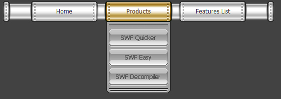
So what is tabbed navigation? Well, it is essentially a set of buttons most often set horizontally. Tabs generally follow numerous different styling guidelines. First, a tab set usually is attached to or slightly protrudes from a container, like in the example below. Also, notice how the open tab matches the background color of the container, and the other buttons are darker. This is another common styling guideline.

When you look at tabbed navigations, you will also notice many styling trends. First, many tabs will have rounded corners on buttons. This helps to create a clean look. Also helping to make a clean look is the use of separation between buttons. Most designs use space to separate buttons, but a bevel, single line, or background color contrast will also look nicely.

You will also see the use of hover effects, which is a common usability characteristic of the tabbed navigation. Gradients, radial and linear, help to achieve an impressve hover effect that brings dimension to the button that the user is selecting. Actually, you will notice that many tab buttons, selected or not, will use a slight gradient to add depth and demension to the button. This is a very simple detail often used to bring extra styling to many different user interface elements, such as buttons. The most important aspect in the design of tabbed navigation is that the active tab needs to be clear and obvious. This is what separates a tabbed navigation from an ordinary horizontal row of buttons or hyperlinks (thanks, Allen).
So, with all of that in mind, take a look at these excellent tabbed-navigations shown below. Look for the trends, and follow the link to further inspect the usability of the tabbed navigation and how it looks with the rest of the design.

City of Grace
A good example of tabs that work nice colors into a usable layout.

Revolution Drviving
Brilliant button backgrounds that aren’t over the top make these tabs really great.

Track My People
These buttons use gradients for depth, and a drop shodow to add demension to the tabs behind the selected one.

Jobs on the Wall
More brilliant styling, these tabs fit perfectly with the other elements on the site.

LittleLines
This is one of the better examples of styling in this showcase because of the gradients to add dimension to the buttons and strong borders.

Magpie
Doesn’t get much more simple than this, but still a good example.

The Invoice Machine
The navigation below uses a strong color difference, usable buttons, and borders to separate tabs from the rest of the design.

Inkd
Good styling and usable because of size and separation.

On websites that have a lot of pages, breadcrumb navigation can greatly enhance the way users find their way around. In terms of usability, breadcrumbs reduce the number of actions a website visitor needs to take in order to get to a higher-level page, and they improve the findability of website sections and pages. They are also an effective visual aid that indicates the location of the user within the website’s hierarchy, making it a great source of contextual information for landing pages.

What is a breadcrumb?

A “breadcrumb” (or “breadcrumb trail”) is a type of secondary navigation scheme that reveals the user’s location in a website or Web application. The term comes from the Hansel and Gretel fairy tale in which the two title children drop breadcrumbs to form a trail back to their home. Just like in the tale, breadcrumbs in real-world applications offer users a way to trace the path back to their original landing point.

navigation menu

You can usually find breadcrumbs in websites that have a large amount of content organized in a hierarchical manner. You also see them in Web applications that have more than one step, where they function similar to a progress bar. In their simplest form, breadcrumbs are horizontally arranged text links separated by the “greater than” symbol (>); the symbol indicates the level of that page relative to the page links beside it.

In this article, we’ll explore the use of breadcrumbs on websites and discuss some best practices for applying breadcrumb trails to your own website.

When Should You Use Breadcrumbs?

Use breadcrumb navigation for large websites and websites that have hierarchically arranged pages. An excellent scenario is e-commerce websites, in which a large variety of products is grouped into logical categories.

You shouldn’t use breadcrumbs for single-level websites that have no logical hierarchy or grouping. A great way to determine if a website would benefit from breadcrumb navigation is to construct a site map or a diagram representing the website’s navigation architecture, and then analyze whether breadcrumbs would improve the user’s ability to navigate within and between categories.

Breadcrumb navigation should be regarded as an extra feature and shouldn’t replace effective primary navigation menus. It’s a convenience feature; a secondary navigation scheme that allows users to establish where they are; and an alternative way to navigate around your website.

Types of Breadcrumbs

Location-based
Location-based breadcrumbs show the user where they are in the website’s hierarchy. They are typically used for navigation schemes that have multiple levels (usually more than two levels). In the example below (from SitePoint), each text link is for a page that is one level higher than the one on its right.

navigation menuAttribute-based
Attribute-based breadcrumb trails display the attributes of a particular page. For example, in Newegg, breadcrumb trails show the attributes of the items displayed on a particular page:

dhtml menu

This page displays all computer cases that have the attributes of being manufactured by Lian Li and having a MicroATX Mini Tower form factor.

Path-based
Path-based breadcrumb trails show users the steps they’ve taken to arrive at a particular page. Path-based breadcrumbs are dynamic in that they display the pages the user has visited before arriving on the current page.

Benefits of Using Breadcrumbs

Here are just some of the benefits of using a breadcrumb trail.

Convenient for users
Breadcrumbs are used primarily to give users a secondary means of navigating a website. By offering a breadcrumb trail for all pages on a large multi-level website, users can navigate to higher-level categories more easily.

Reduces clicks or actions to return to higher-level pages
Instead of using the browser’s “Back” button or the website’s primary navigation to return to a higher-level page, users can now use the breadcrumbs with a fewer number of clicks.

Doesn’t usually hog screen space
Because they’re typically horizontally oriented and plainly styled, breadcrumb trails don’t take up a lot of space on the page. The benefit is that they have little to no negative impact in terms of content overload, and they outweigh any negatives if used properly.

Reduces bounce rates
Breadcrumb trails can be a great way to entice first-time visitors to peruse a website after having viewed the landing page. For example, say a user arrives on a page through a Google search, seeing a breadcrumb trail may tempt that user to click to higher-level pages to view related topics of interests.

Breadcrumb Navigation Design Considerations

When designing a breadcrumb navigation scheme, keep several things in mind. Let’s take a look at some questions that might arise when you’re working with breadcrumbs.

What should be used to separate link items?
The commonly accepted and most recognizable symbol for separating hyperlinks in breadcrumb trails is the “greater than” symbol (>). Typically, the > sign is used to denote hierarchy, as in the format of Parent category > Child category.

Article Scource: http://www.smashingmagazine.com/

A good navigation would mean that you have a user-friendly website. And if you have a user-friendly website, expect that your online visitors would be comfortable browsing your site and would definitely come back for more visits. Come to think of it, where would you like to stay longer? In a website where you have to click on the sitemap every time your browse or in a website where you can easily find what you are looking for with just a few clicks?

Here are great navigation tips on how to make your website design user-friendly:

A clean website with a good navigation is always a plus. You can enhance the look of your website with graphics but make sure that you focus on your content and use a lot of white space. If you are to create links to a content site, you can use contrasting colors.

Do not clutter links. Make sure that you organize your links and they are all working.

Dead links can give an impression of sloppiness and haphazard work? If you have too many links, you can categorize them accordingly in drop down menus. You can also use flyouts links for your main categories.

Create a navigation system that is consistent and clean-cut. If you have your links on a drop down menu under one category, then you must have the same navigation with the rest of your site categories.

Your website design should accommodate a large number of links as you may have to add links in the future. As you add more pages to your site, then you need to add more space for additional links.

Categorize your website content in sections so you can gather up related links. You can use section home pages for certain categories or sections.

Your main links should be kept together.
This way, your visitors can know what your website covers at just one glance. The links to your site’s main sections should convey what your website is all about. If it is a business website- your main links should show what products or services you have to offer.? Links can be placed on navigations bars. They are often listed on the right side of the menu bar. You can also line them up neatly, just below your header.

In creating text links for your website, have it short and simple. The words should precise enough to know what that page would contain once clicked.

If you think a link is important to your reader or if you want them to go to a certain section in your site, you can make this link as a feature link of your site. You can have a different front color for this special link, boxed it up or have it in bold font.

Article source: http://business.ezinemark.com/
Google always come up with some design or layout changes to improve Search Experience. This time, the navigation bar present on the top of homepage and search result page is redesigned and the bar will show your name instead of the email ID. The redesigned navigation bar is having the same navigation links like Web, Images, Videos, Maps, News, Shopping, Gmail and More on left side, but the right side of the bar is changed. Earlier the right side of the bar was showing iGoogle, Search Settings and Sign In links, but now only Sign In and a settings icon is there.

Note: Redesigned navigation bar is available on Google.com only.

navigation menunavigation link

You can sign in using Google account by clicking on the “Sign In” link. The settings icon will show you options like “Search Settings, iGoogle and Privacy” without signed in. Once you will sign in with Google account, your name will appear on the right side of the bar and email ID will be visible only after clicking on the name. You can browse the list of subscribed services from “Settings Icon ==> Account Settings” which is available in the right most of the bar.

The redesigned bar is giving Google homepage and SERP much cleaner and improved look. What is your opinion on that? Share your thoughts on the new redesigned navigation bar of Google.

White menu refers to drop down menu which adopts white as the main color to navigate website. As we known, white is the feasible color to match with all kinds of color, it can create wonderful visual matchable effect with other colors. Similarly, white menus are also wild navigation menu to decorate most websites of different colors. Besides color, white menus can be built in horizontal level, vertical level, tab menu, round-corner menu and multi-column menu. Next, let’s appreciate changeable menu styles:

White menu – horizontal menu

  • Special menu designed by Jason Reed Web

White Menu - Horizontal Menu

  • Gotmilk Flash menu

White Menu - Horizontal Menu

  • Web menu designed by Jeremy Levine

White Menu - Horizontal Menu

  • Maxandlous.com unusual menu

White Menu - Horizontal Menu

  • JavaScript menu with handwring style

White Menu - Horizontal Menu

  • Web menu with button style

    White Menu - Horizontal Menu

  • DHTML Menu for Jayme Blackmon

White Menu - Horizontal Menu

  • Alex Buga menu

White Menu - Horizontal Menu

  • Water’s Edge Media web menu

White Menu - Horizontal Menu

  • Ronnypries.de navigation menu

White Menu - Horizontal Menu

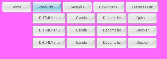
  • Pipe DHTML menu

White Menu - Horizontal Menu

White menu – round corner menu

  • Round style menu with mouse over

White Menu - Round Corner Menu

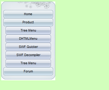
  • Silver round corner menu

White Menu - Round Corner Menu

White menu – tab menu

  • Silver tab menu

White Menu - Tab Menu

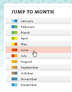
  • Vertical tab menu

White Menu - Tab Menu

  • Fubiz slidebar

White Menu - Tab Menu

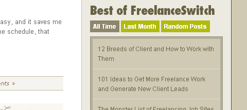
  • Great FreelanceSwitch menu

White Menu - Tab Menu

White menu – multi-column menu

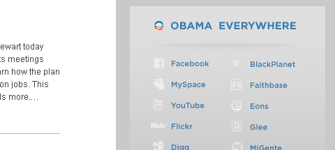
  • Barack Obama menu

White Menu - Multi-Column Menu

  • “Speaking” navigation menu

White Menu - Multi-Column Menu

  • Multi-column menu navigation

White Menu - Multi-Column Menu

White menu – vertical menu

  • lace web menu

White Menu - Vertical Menu

  • Cobahair.co.uk uses only BIG typography…

White Menu - Vertical Menu

  • jBunti Hover-effect Menu

White Menu - Vertical Menu

  • Icon vertical menu

White Menu - Vertical Menu

  • nBloom menu with animation
    White Menu - Vertical Menu
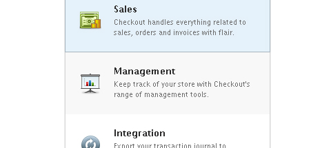
  • Checkout list-style menu

White Menu - Vertical Menu

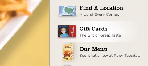
  • Ruby Tuesday slidebar menu

White Menu - Vertical Menu

  • Alexandru Cohaniuc Navigation

White Menu - Vertical Menu

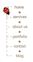
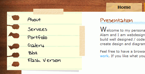
  • Web menu – handwriting style

White Menu - Vertical Menu

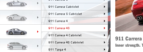
  • web menu of Porsche Canada

    White Menu - Vertical Menu

There are an extensive amount of roads you can take in web design, specifically in navigation. Here, we will talk about one specific navigation technique, tab-based navigation. If properly carried out, tabbed navigation can be very clean and organized within a web layout.

So what is tabbed navigation? Well, it is essentially a set of buttons most often set horizontally. Tabs generally follow numerous different styling guidelines. First, a tab set usually is attached to or slightly protrudes from a container. Also, notice how the open tab matches the background color of the container, and the other buttons are darker. This is another common styling guideline.

When you look at tabbed navigations, you will also notice many styling trends. First, many tabs will have rounded corners on buttons. This helps to create a clean look. Also helping to make a clean look is the use of separation between buttons. Most designs use space to separate buttons, but a bevel, single line, or background color contrast will also look nicely.

You will also see the use of hover effects, which is a common usability characteristic of the tabbed navigation. Gradients, radial and linear, help to achieve an impressve hover effect that brings dimension to the button that the user is selecting. Actually, you will notice that many tab buttons, selected or not, will use a slight gradient to add depth and demension to the button. This is a very simple detail often used to bring extra styling to many different user interface elements, such as buttons. The most important aspect in the design of tabbed navigation is that the active tab needs to be clear and obvious. This is what separates a tabbed navigation from an ordinary horizontal row of buttons or hyperlinks.

So, with all of that in mind, take a look at these 5 excellent tabbed-navigations shown below. Look for the trends, and follow the link to further inspect the usability of the tabbed navigation and how it looks with the rest of the design.

Veer9
These tabs have beautiful styling. Notice the use of different colors and a drop shadow for separation purposes.
tabbed menu

Wire & Twine11
This is some excellent texture use with a clean layout.
tab menu

Komodo12
A good example of tabs used in a module.
tab menu

Inkd13
Good styling and usable because of size and separation.
tab menu

Kinder-Aktuell15
Good gradient use and separation.
tab menu

Having a clean and well-structured website navigation is key in designing an effective user interface. Drop-down menus are great for sites that have multiple levels of content hierarchy. The typical design pattern of a drop-down menu is that when a user hovers over the parent navigation item, a submenu of navigation items appea.

In this collection are many different types of drop-down menus used in websites all over the web for your navigation design inspiration.

Here are some related collections regarding site navigation that you may also be interested in:

Carreras Con Futuro

This drop-down menu’s design embodies the hand-drawn theme of the website.

drop down menu

Converse

Converse has a grunge-styled drop-down menu that has a cloth-like texture with frizzy edges.

Navigation menu

Bern

This rough grunge style website has an edgy drop-down menu that complement the look-and-feel of the website’s general aesthetics.

dhtml menu

Ski Alpine

This drop-down menu highlights the attention to detail that the site designer has.

navigation bar

Noizi Kidz

This navigation is bright and shaped unconventionally.

menu maker

Famous Cookies

This drop-down navigation menu showcases the yummy cookies that the store makes available to its hungry patrons.

Boden

Each menu item has a different font and the drop-down menu is very clean.

web menu

Navigant Consulting

The colours used on this site work together like players of a football team.

menu builder

Fall For Tennessee

Fall for Tennessee has a horizontal drop-down menu that slides out to the right hand side. The menu items that have a drop-down submenu have a small arrow next to them to indicate that they can be expanded.

web menu maker

Mozilla

This is a simple yet sleek drop-down menu on the Mozilla.

drop-down menu