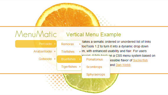
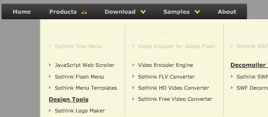
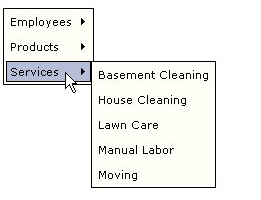
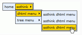
I believe the navigation of a website should always be simple. However, if a website has many pages and sub pages, the thought of navigation simplicity goes out the window. This is where drop down menus come into play. A good and well executed drop down menu can make navigating a large site easy for the user. While drop downs make site navigation easy, sometimes they can seem difficult to implement, but the solutions listed below are all a breeze to set up, especially since most of them are built on jQuery or MooTools.
Archive for the ‘Latest Samples’ Category
There are an extensive amount of roads you can take in web design, specifically in navigation. Here, we will talk about one specific navigation technique, tab-based navigation. If properly carried out, tabbed navigation can be very clean and organized within a web layout.
So what is tabbed navigation? Well, it is essentially a set of buttons most often set horizontally. Tabs generally follow numerous different styling guidelines. First, a tab set usually is attached to or slightly protrudes from a container. Also, notice how the open tab matches the background color of the container, and the other buttons are darker. This is another common styling guideline.
When you look at tabbed navigations, you will also notice many styling trends. First, many tabs will have rounded corners on buttons. This helps to create a clean look. Also helping to make a clean look is the use of separation between buttons. Most designs use space to separate buttons, but a bevel, single line, or background color contrast will also look nicely.
You will also see the use of hover effects, which is a common usability characteristic of the tabbed navigation. Gradients, radial and linear, help to achieve an impressve hover effect that brings dimension to the button that the user is selecting. Actually, you will notice that many tab buttons, selected or not, will use a slight gradient to add depth and demension to the button. This is a very simple detail often used to bring extra styling to many different user interface elements, such as buttons. The most important aspect in the design of tabbed navigation is that the active tab needs to be clear and obvious. This is what separates a tabbed navigation from an ordinary horizontal row of buttons or hyperlinks.
So, with all of that in mind, take a look at these 5 excellent tabbed-navigations shown below. Look for the trends, and follow the link to further inspect the usability of the tabbed navigation and how it looks with the rest of the design.
Veer9
These tabs have beautiful styling. Notice the use of different colors and a drop shadow for separation purposes.

Wire & Twine11
This is some excellent texture use with a clean layout.

Komodo12
A good example of tabs used in a module.

Inkd13
Good styling and usable because of size and separation.

Navigation menus have to be intuitive, precise and easy-to-use. One simple, basic principle, which is common for all kinds of nav bars you would ever want to use for your projects. In fact, navigation menu is probably the most important element in web design: after all, it is being used more often than any other element on a given page. Therefore it’s important to make sure that your visitors will find they way around the site structure – however complex the latter might be.
So how do designers cope with a challenging task to create an attractive and usable menu? Which results can be achieved? OK, that’s a tough one. Let’s take a look around.
Below you’ll find 8 beautiful and user-friendly Navigation Menus and solutions.
BREAKER DESIGN
folietto
Pulmad, peod, lillesalong… – Annilill Peoteenindus
coda.coza
EGOLOUNGE *Büro für digitales Design
Convan Design – Howdy
far from fearless
Erika Greco – Blog
Nav bar is regarded as the most important element in website design because it is usually placed in the most visible location of the webpage, which makes a significant impact on the visitor’s first impression. Website designers always seek for outstanding nav bar styles to sustain the viewer’s interest. As the adage goes, “Content is king”, but getting to the content requires navigation. The modern nav bar not only needs clear-structure navigation, but also applies remarkable menu style to attract the eyes.
Nav bar generally comes in one of two orientations: vertical and horizontal. Horizontal nav bar displays items side by side; vertical nav bar stacks items on top of each other. Next, we will enjoy 15 nav bar styles of horizontal and vertical to give your more inspiration.
Horizontal nav bar with rounded corners
LemonStand
LemonStand’s primary navigation features rounded dark-gray buttons with a slight gradient.
gugafit
gugafit’s navigation buttons change to green on hover. The active item is given a dark-blue pressed look.
PeepNote
PeepNote has beige rounded buttons, with the active menu item in blue. It also uses the CSS 3 text-shadow property to add drop-shadows in most modern Web browsers.
Modern web menu
This DHTML menu is clean and popular, which is widely used for many industry. The web menu made by Sothink DHTML Menu presents us the silver and rectangle shape of menu item.
Crystal JavaScript menu
This crystal menu delivers the sense of modern, fashion and elegance. Round rectangle design gives you more imaginations – button.
Horizontal nav bar with icon
Carsonified
Carsonified uses icons to indicate the active menu item; and upon hovering over an inactive menu item, its icon is revealed.
MobileMySite.com
The company behind this website specializes in creating mobile versions of websites, so the designer made the navigation look similar to the iPhone’s UI41, making it seem familiar to first-time visitors.

RedVelvetart.com
This website features hand-drawn elements, and the navigation menu continues that theme with hand-drawn and -sketched icons above the text.
Dot JavaScript menu
Sothink DHTML Menu creates this classic red & black nav bar, the red dots work as separator to divide the menu items. When moving the mouse over the menu item, you will see the popup menu shown in line, and white dots divide the 2-level menu item.
Image DHTML menu
The image works as icon, the top icon and the bottom text together explain the usage for this menu item. Just see the image, you will know where the menu item will link to.

Vertical nav bar with various styles
Mellasat Vineyard
Mellasat Vineyard’s vertical navigation menu is a modular, one-piece design element that also contains the website name and logo. The menu is a focal element here.
Utah.travel
This interactive menu has a slick slide-out menu that displays sub-links and content when a user hovers over a primary menu item.
A J Miles
The portfolio of A J Miles has vertical navigation as its primary visual element. The menu is fashioned as a piece of paper held in position by tape.
Notorious Design
In this navigation system, the primary links are vertically oriented. Sub-menu items come out horizontally.
Envira Media Inc
This irregularly arranged menu truly embodies the website’s organic look and feel. Icons on the left of each item help with visual recognition and complement the design.
Having a clean and well-structured website navigation is key in designing an effective user interface. Drop-down menus are great for sites that have multiple levels of content hierarchy. The typical design pattern of a drop-down menu is that when a user hovers over the parent navigation item, a submenu of navigation items appea.
In this collection are many different types of drop-down menus used in websites all over the web for your navigation design inspiration.
Here are some related collections regarding site navigation that you may also be interested in:
Carreras Con Futuro
This drop-down menu’s design embodies the hand-drawn theme of the website.
Converse
Converse has a grunge-styled drop-down menu that has a cloth-like texture with frizzy edges.
Bern
This rough grunge style website has an edgy drop-down menu that complement the look-and-feel of the website’s general aesthetics.
Ski Alpine
This drop-down menu highlights the attention to detail that the site designer has.
Noizi Kidz
This navigation is bright and shaped unconventionally.
Famous Cookies
This drop-down navigation menu showcases the yummy cookies that the store makes available to its hungry patrons.
Boden
Each menu item has a different font and the drop-down menu is very clean.
Navigant Consulting
The colours used on this site work together like players of a football team.
Fall For Tennessee
Fall for Tennessee has a horizontal drop-down menu that slides out to the right hand side. The menu items that have a drop-down submenu have a small arrow next to them to indicate that they can be expanded.
Mozilla
This is a simple yet sleek drop-down menu on the Mozilla.
In this post I’d like to take a look at more than 5 stellar examples of navigation menus that positively impact the design of a website. The list includes a great deal of variety. Regardless of what you personally prefer, there should be some inspirational examples in here for you.
Soula
Africa Oasis Project
Tennessee Vacation
Timothy Sykes
Website menu has really important role in almost all websites, it makes website navigation easier and saves space to display the more contents. Besides, the modern website menu has the features of usability and appearance. A clear and usable menu can guide the users to the wanted page with one-click; and an attractive and eye-catching web menu can decorate the website better. To create a website menu, there are several techniques available, such as JavaScript, CSS, jQuery, Flash and Database. Let’s view the website menus made by various techniques:
Website menus made by jQuery
jQuery menu is a trend for website navigation, it is the easiest and best supported way to implement simple animation online.
Website menus made by Flash
Flash website menu impresses the viewers because of the stunning animation and well cross-browser compatibility.
Database-driven website menu
This type of website menu is generated from database, such as ASP, PHP, JSP, ASP.NET, ColdFusion and more.
Website menu has really important role in almost all websites, it makes webiste navigation easier and saves space to display the more contents. Besides, the modern website menu has the features of usability and appearance. A clear and usable website menu can guide the users to the wanted page with one-click; and an attractive and eye-catching website menu can decorate the website better. To create a website menu, the several techniques are available, such as JavaScript, CSS, jQuery, Flash and Database. Let’s view the website menu styles made by various techniques:
Website menu styles made by JavaScript
The navigation of a website is meant to be clicked. It shouldn’t be hard to find. It’s important that it stands out from the rest of the elements on the page with elegant style but yet still matches the overall style and color of the design. Here is a showcase of websites that achieve this in a very stylish way. These navigations look amazing, have serious click appeal, and are guaranteed to inspire you for it’s beautifully color variation with the whole website.
Positive Impressions
Hart & Huntington
Amigo in Granada
Yankee Soda
Kelt
What is one of the aspect of a website that always needed? It is the navigation menu. Navigation menu is a useful part of the website because it leads the user to different part of the website. Interaction to the website is the main use of the navigation menu. More and more great looking and user-friendly navigation menus are being created that gives life to the websites. I’ll be featuring 8 great looking and really unusual navigation menus which are CSS-based design solutions, JavaScript-based menus and Flash-designs.
Dave Werner
A creative person uses his own works to lead the users on his portfolio.
Enila.fr
Small squares that put together that acts as the navigation and collaboration of works.
Got Milk?
An interesting navigation in a ribbon with a simple hover effect. When an icon hovered, the content menu is presented.
Havaianas
A colorful map that has the touch of the slipper texture that Havaianas proud about.
HBO
HBO , a tv-movie network, creates an interactive selection of movies for its navigation.
Waterlife
The fluid navigation menu that brings you to the motion of a lake.
Cognigen
Presents a pressed and clear view of the navigation.
Jeff Sarmiento
Sloping Navigation that creates a creativity and a punk style looking menu that Jeff Sarmiento used.







 Buy or sell a logo
 iOS Data Recovery
 Mobile Data Transfer